
Bob Lillecrapp and Julien Pourik, Directors at Circle Foods (formerly known as Intermeats) came to us back in December 2019. Their company originates from France as one of the country’s largest producers of pork and was established as Intermeats in the UK in 2011, now sourcing and supplying food worldwide. As the business evolved, their product offering expanded beyond just meat and the Directors felt a new name was needed to better reflect the broader array of food supply services delivered by their multinational team.
Sue & Beccy began with a strategic review of the existing brand, looking at the competitive landscape and understanding the client’s key objectives. We put forward a selection of recommended name options that we felt could work well in the international marketplace. There were two names that were clear front runners when we presented the options to Bob and Julien. With both names, a core theme had clearly emerged and I was able to begin to think about how this could translate into a brand identity.
Bob and Julien have kindly allowed us to share the design journey that led to the Circle Foods brand:
The teamwork of design
As with all our clients, we sat down as a team to ensure I had a comprehensive understanding of the strategy and what is required of the new brand, such as key USPs, values, where they see themselves positioned within their sector and their plans for growth.
The company is a global food trading company based in Reigate, offering a tailored partnership with food suppliers to deliver top quality products. They are prided on their great customer service and expertise. They are trusted, have integrity and reliability and this all needed to be captured in their brand essence. It was important that the new brand was not positioned as overly premium, yet still represented the high quality of produce and service provided by the company. The company is growing with product offering and services expanding. The new brand needed to have the ability to hold strong through the rapidly evolving nature of the business.
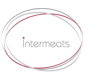
This was their original logo and name. They used a circular device which is still very relevant but the whole look and feel is a little out of date and the name no longer matches their service offering.
Why Circle Foods?
Circle: conveys the 360 nature of the business from source to end sale. ‘Circle’ also reflects the company’s focus on service and how they work in partnership with their suppliers to meet the individual needs of their customers.
Foods: moves away from the focus on meat to a wider product range.
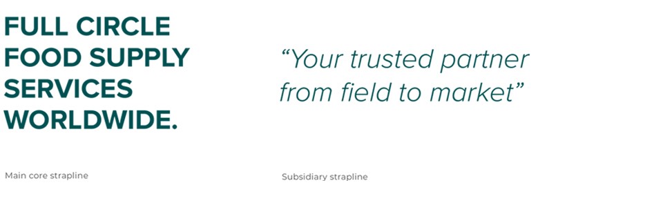
To drive home the key values and clear service offering of the company we accompanied the logo with a primary and secondary strapline.
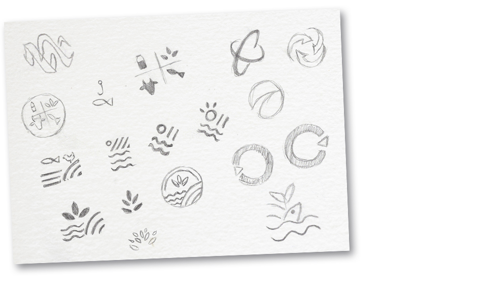
STAGE 1: Idea Exploration
Initial Concepts:
World, global - circle
Cycle - food cycle, circle, arrow
From nature to mouth - food cycle concept (sea, land, sun)
These are some of the ideas explored and a few sketches of my initial ideas:
STAGE 2: Development
I worked up a number of logo concepts. As a team, we discussed the options and decided upon the 3 strongest routes to present. I progressed these routes into 3 style tiles. A style tile is a document designed to push the logo and style scope. It helps our clients to visualise how the logo and styling could be implemented, revealing its promise and how we see them working across different collateral. It’s a chance for a client to really see how the brand could come alive and help them pinpoint the look and feel they aspire to.
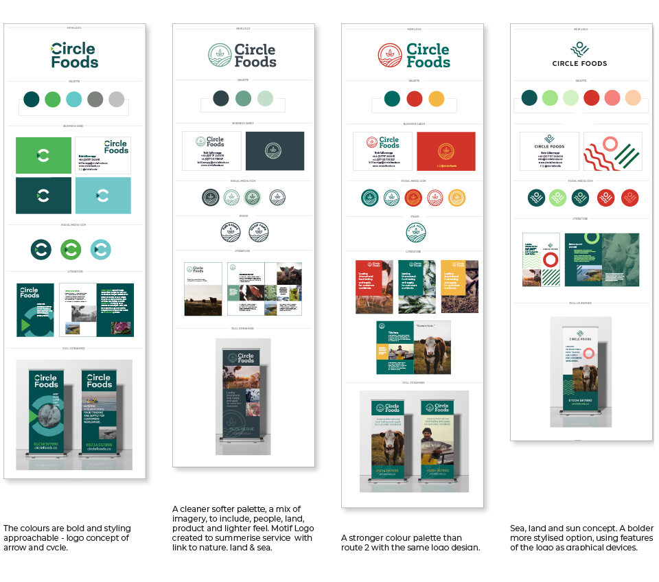
STAGE 3: Selection & Refinement
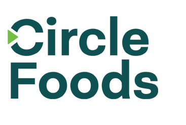
This was the concept that was chosen. The arrow signifies a cycle and distribution, as well as keeping the circle concept. The typeface is modern and approachable.
Focusing on this route, I explored layout options for the arrow C icon and type. It’s always worth exploring this to ensure the first instinct is correct. In this case the marked option below was preferred, where the C arrow icon has more impact and Circle Foods can sit alone and be easily legible.
Little minor tweaks were made to the size of the arrow at this stage until we arrived at the final logo:
STAGE 4: Final Presentation and Brand Guidelines
This was the final logo:
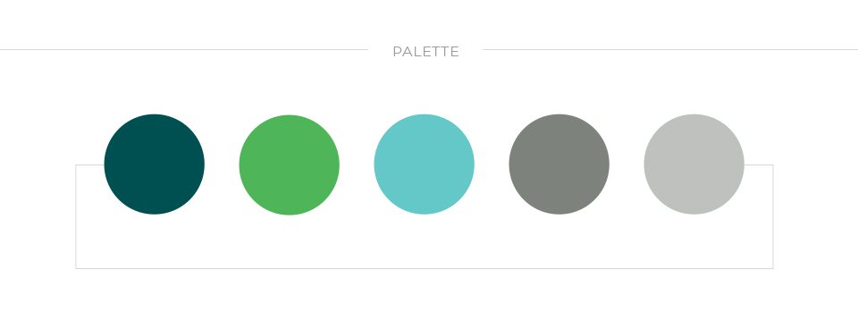
The style tile of design elements was really well received and colour palette approved, so amendments at this stage were minor. The colour green is very strong, it instils confidence and is calming and reassuring to the target audience; greens and blues were also chosen around the palette of the natural world, from where our food originates.
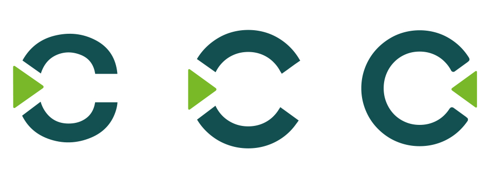
As part of a rebrand we also look at image styling and carefully choose the direction with which to proceed, both content and style. With Circle Foods we included imagery that covers the cycle of food production, including the people behind the products, landscapes and animals. The aim was to achieve a more holistic and natural back-to-source look and feel that reflects the 360 nature of the business.
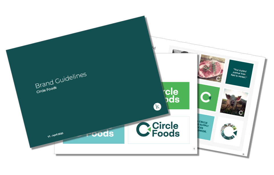
To complete a rebrand, we produce a Brand Guidelines document. This sets out the guidelines to protect the new brand, to help designers implement the style and retain the integrity of what we have designed for the client. The guidelines give the do’s and don’ts of how to use the logo, outlines the font choices, displays layouts of any already designed items, gives colour breakdowns, secondary palette of colours for future use and any photography styling suggestions.
Initial Brand Rollout
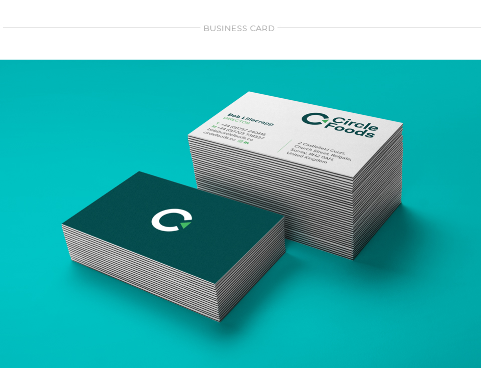
Business Cards were designed with a focus on concisely conveying key information. The icon stands alone on the back as a strong confident mark, one that can be used on social media and on signage in the future. The idea is that the icon will become instantly recognisable as the company rolls out brand communications and other marketing activity.

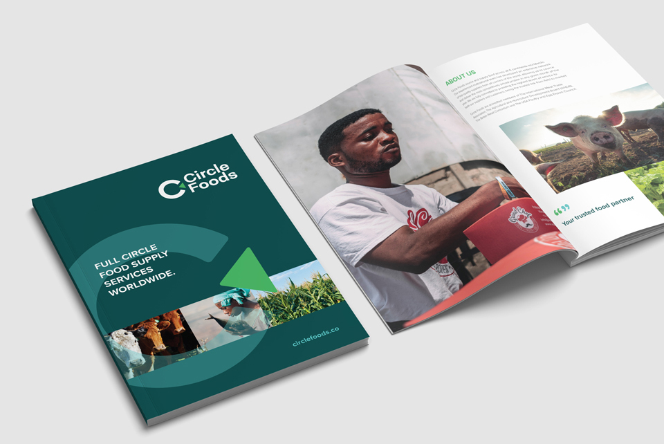
The brand was able to really come alive when the food brochure was designed. It worked nicely with a mix of lighter layouts and full colour spreads with carefully chosen imagery breathing life into the story behind the products. Click here to view the brochure in full.
The new brand has been rolled out to include a suite of elements, such as stationary, email signatures, social media styling and signage. Our team have also designed and built a fully bespoke website for Circle Foods which has recently launched and includes a video to introduce the new name for use across all communications.
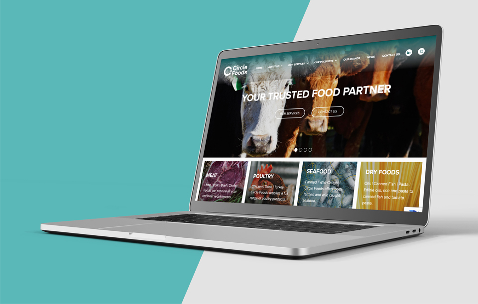
Click here to view the Circle Foods website.
Circle Foods now has a brand that accurately represents what they do. The brand is modernised and approachable, whilst also reflecting the breadth of products and customer-focused expertise held with their team.
We wish Bob, Julien and the team every success and look forward to seeing the company grow further.
“A huge thank you to Beccy Tombs and the team at Your Marketing Team for developing our new name, logo, website and video. We are extremely happy with the work they have done and can highly recommend them.” - Bob Lillecrapp, Director, Circle Foods
Do you think your company's branding looks outdated and could benefit from a fresh new look? Contact our team to see how we can reinvigorate your business with a rebrand.