There is always room for experimentation in the world of graphic design and designers will continue to push boundaries, that’s what we do. Trends and tastes will evolve and change, and these are often reflective of the wider socio-economic events taking place. With the world going through such challenging times, now is perhaps not the right time for brands to make radical, risky design choices. I am sure there will be some exceptions that break the mould, but I see a return to old favourites such as graphics to help instil a sense of calm, security, and comfort with an emphasis on clear communication.
After the very unpredictable nature of 2020, it feels like a near impossible task to predict what lies ahead! However, I have picked some of the key design trends that are emerging, and which look set to feature prominently in the coming year:
1. Muted Colours
Muted colours have been growing in popularity and the trend shows no sign of slowing as it evokes a sense of calm and this is especially welcome in our chaotic world at the moment. Bright loud colours have dominated the visual world for so long, and while they definitely still have their place and demand our attention, a fresher more natural palette is a welcome new trend.
LinkedIn is a great example to illustrate this concept. Their brand uses subtle pastel and muted colour tones in their online messaging and creates a platform people feel at ease with. They have adapted particularly well to the pandemic with their social media advertising. Here are a few examples:
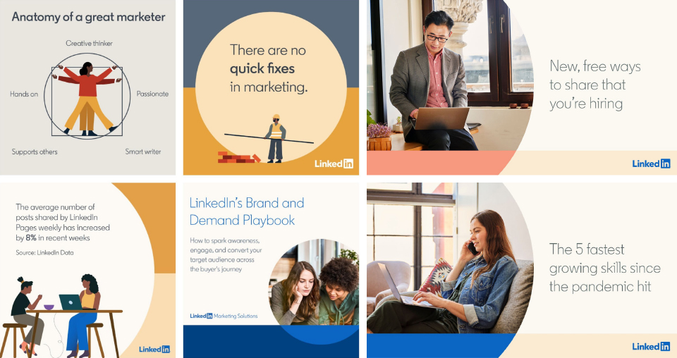
Source: LinkedIn
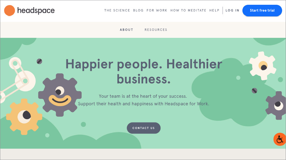
Source: Headspace
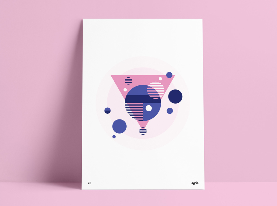
2. Geometric Shapes
Shape has always been a big influence in graphic design but this year carefully placed geometric shapes may be of huge inspiration. Placed in balanced considered compositions, forming a simple, minimal aesthetic and a base to hold text and content, they are an exciting design trend I look forward to using in my work. They can take on a more ambiguous looser grid which is exciting and produce great contrast. Image and shape will also combine to form exciting compositions. There is great scope for animation within this design trend as well.
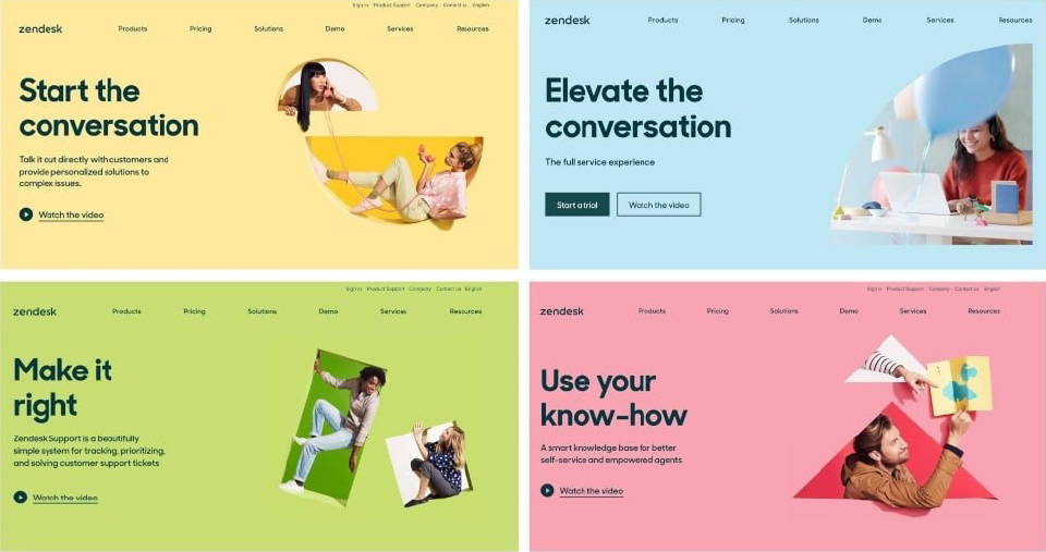
Source: Zendesk
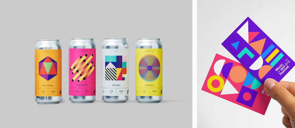
Source: Matthew Luxford - Craft beers, Broklin Onjei
3. Minimalism
Minimalism and simple design has been a graphic aesthetic that continues to dominate. It is important that there is lots of white space and clarity so that the viewer can easily navigate design and so that the key messages are not cluttered and mixed.
This will continue to be of focus this year.
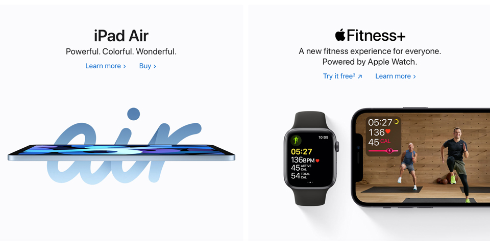
Source: Apple
Source: Triggered Instagram Feed
4. The Serif
The classic serif has been making a comeback over the past few years. It is trustworthy and nostalgic and becoming increasingly popular again, showing it is timeless.
Here are a few examples of brands that trust in it:
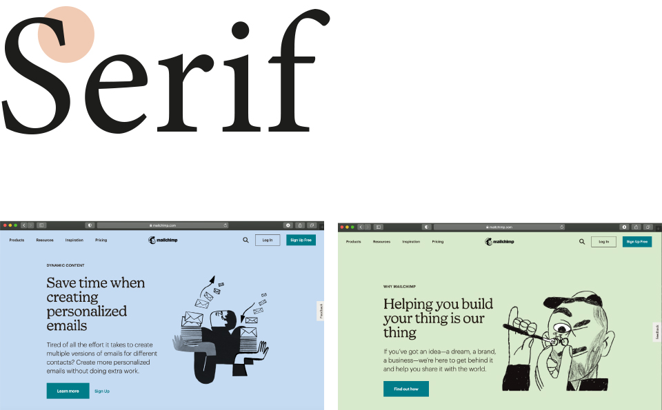
Source: Mailchimp
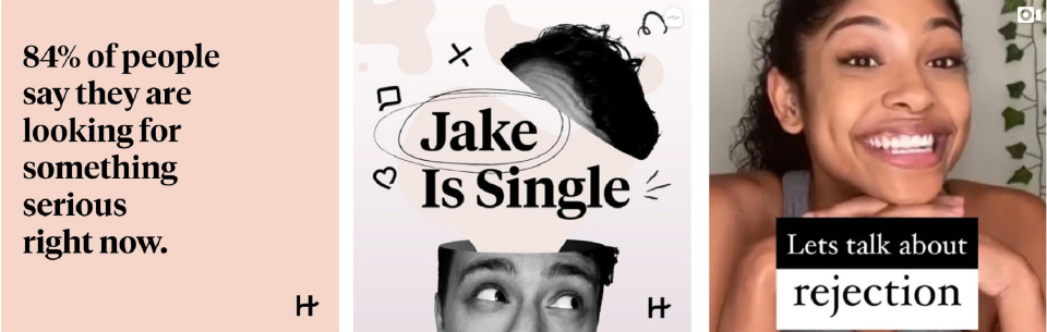
Source: Dating site Hinge
5. Duotone/monochrome
Using a more limited colour palette of duotone or monochrome colour schemes this year, is a design trend that looks set to re-emerge. Single or duo colour designs can have a lot of impact, as seen by these examples below. They can create a calmer, more relaxed, smoother feel and allow designers to be more abstract and experimental in their compositions because of the endless techniques and filters they have open to them.
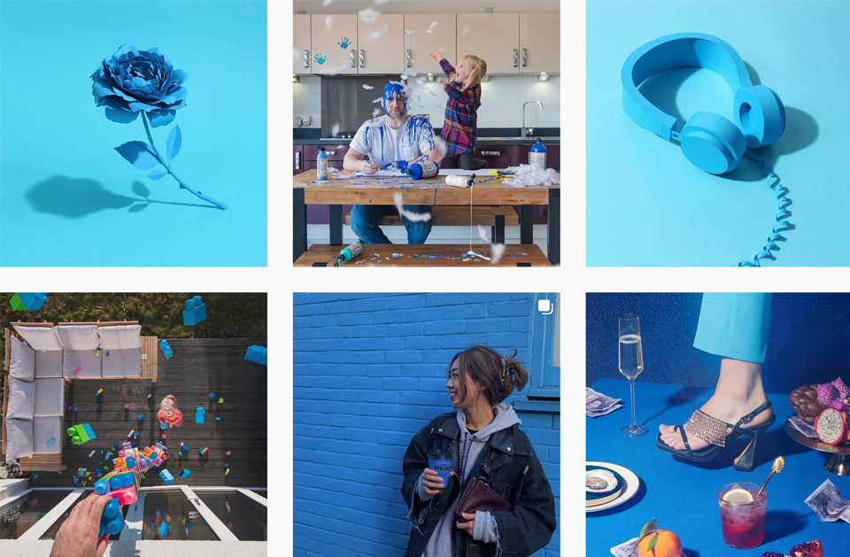
Source: O2 Instagram Feed
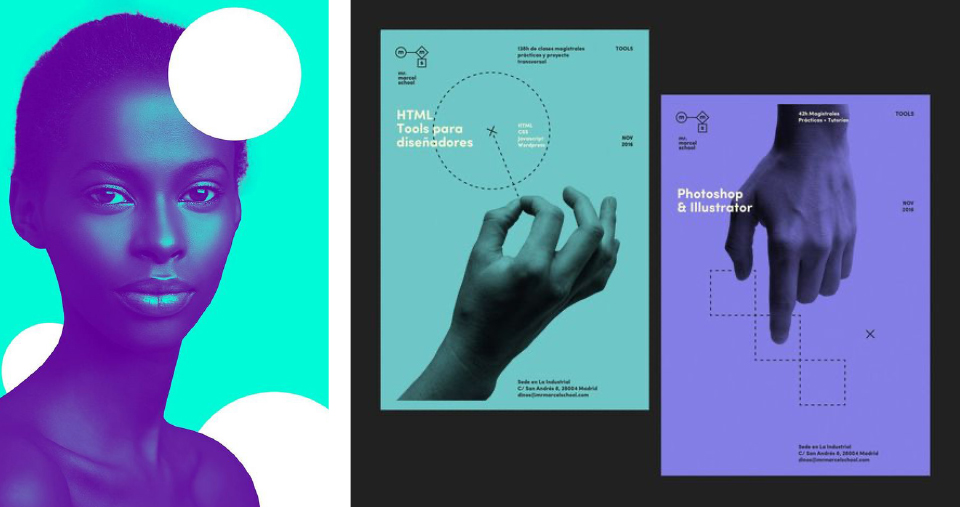
Source: Behance, Designshack
6. Simple Infographics
People don’t want to work hard at looking at numbers and data. They need a clear and concise layout to quickly extract the detail they seek. This year, infographics become yet cleaner, flatter and more streamlined for effective communication. Rather than trying to cram on extra detail for style alone, the message is becoming more focussed and simpler.
Source: Fuszzo

Source: Sprout Social: Twitter use amongst key demographics
7. Motion Logos
The longer we hover over a post or web page, the more likely we are to engage with a brand and so a trend emerging is to enhance that interaction with the consumer by setting a logo into motion. It creates a new dynamic interaction with the audience, which could potentially tell a story, create emotion or help portray brand values. Watching things move is exciting and it can give a brand a new and fresh lift.
Watch out though! It needs to be carefully considered and won’t work for every brand.
Source: Gotikket by Tubik
See more examples here.
8. Overlapping Designs
Overlapping design elements can give depth to graphic design by creating layers of depth. It also allows designers to keep a minimal feel by grouping items to allow for enough visual white space.
This trend can be applied to logos to make associations and sometimes to create illusions.
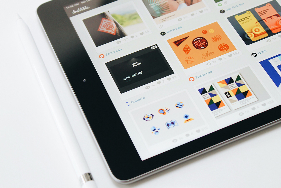
Source: Dribble
9. Colourless
Where 2020 saw the start of the muted colour trend as we have discussed, a trend set to continue this year, black and white could also be set to take off, showing confidence in the other graphic design elements, such as shape, typography, illustration and photography. There is something comforting and calm about it, maybe nostalgic even and it is a softer look than a bright, colourful, loud layout. Maybe going in this opposite direction to get attention will be a winner.
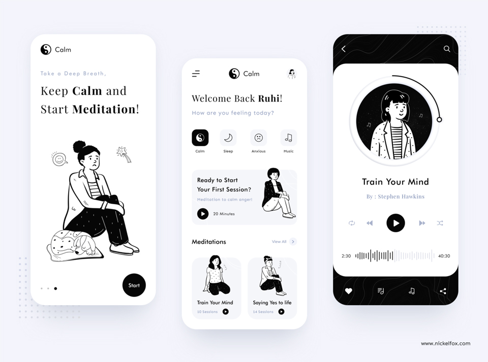
Source: Keep Calm, Bhavna Kashyap for Nickelfox
10. Optical Illusions
This is an eye-catching trend that is a lot of fun. I love this Footlocker campaign - it is not only a visual feast for the eye and matches well with the theme of movement but it also aligns with the trend of black and white design.
Fooling the eye is fun, powerful and an eye-catching way to grab attention and keep the consumer transfixed on the image for longer, with the hope they will engage with the brand.
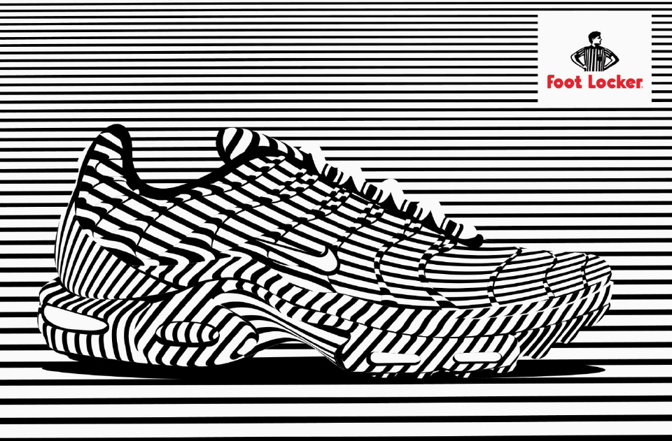
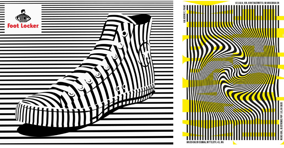
Source: Alex Trochut with Foot Locker, ggrafik.de
Final Thoughts
These are a few of the trends that I believe will thrive this year. There is plenty of scope for experimentation and creativity to deliver unique design. Overall, and uniting each of these individual trends, there is paired-back ‘touch and feel’ that aims to evoke a sense of calm amidst the chaos we have seen in the world of late and to help the consumer build brand trust.
As always, I will continue to consider current trends, but it is also the job of a designer to question them and push boundaries. A true understanding of what a brand stands for and the target market it is trying to reach, must sit at the heart of any brand design. Equally, design must be functional, both in print and on digital platforms. The top priority for our clients is that the end visual result should always portray the values and ethos of their brand and have practical application across all their lines of communication.
To view some of our recent design projects, click here.
Are you considering a brand refresh or need a new brand identity? Contact our team to see how we can help.
Research Sources:
Header Image courtesy of Kerde Severin - Unsplash