Last year, we saw a continued progression towards minimalism within logo design. Some companies chose to strip down their brand identity to a less fussy, more concise communication device, with a stress on form and function rather than decoration. In some cases, there was a departure from colour, a trend predicted for 2022, with a move towards the mono logo - strong, memorable, no-nonsense and uncluttered. Overall, there seemed to be a general shift towards finding something timeless.
Reflecting on 2022 – Simplicity works wonders
Nakd rebranded in June, losing some of their loose grungy edges and removing some of the decoration:

Source: underconsideration.com
Skoda have simplified & minimalised their logo, to bring it in line with their 2030 strategy focusing on electrification & digitalisation. The new 2D version will be easily recognised and more legible for future applications. It is said to be the biggest change to the car manufacturer’s brand identity in the last 30 years.
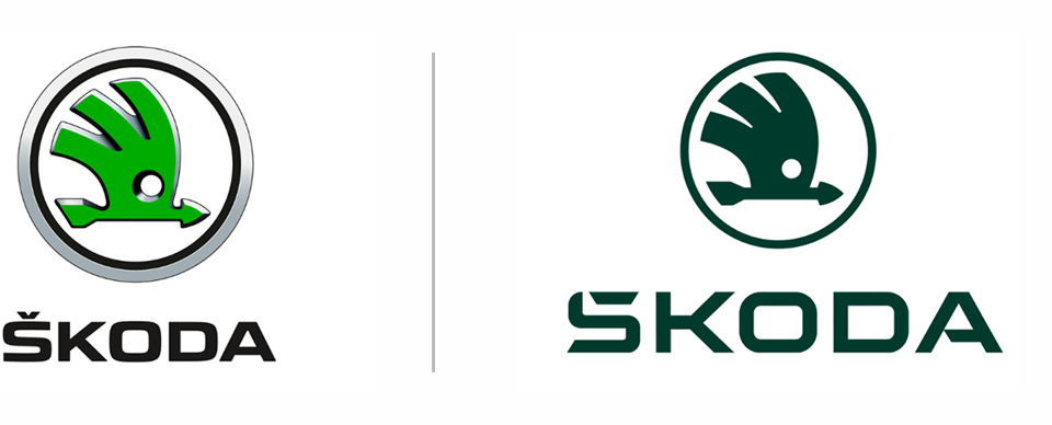
Source: uk.motor1.com
Sprite removed some of the elements on their logo to celebrate and focus on the movement in the typography:
Source: looka.com
What is going to happen in 2023?
As many 2022 trends remain & progress, we predict the ‘less is more’ minimalism route is certainly set to prevail this year. This trend focuses on giving the viewer little visual distraction and aims to offer the audience a welcome visual rest from the noise around us. What’s more, given the turmoil of the past few years, the role of minimalism has become ever more important as we all reassess priorities and the demand for clarity in communications increases.
Saying that, there is always room for creative exploration. Alternative design trends will also thrive this year as graphic designers continue to push boundaries & flex their creative flair. Post-pandemic, we seek escapism which can be effectively delivered via the world of graphic design. We might also see some throwbacks, some nostalgia in which we find comfort; serifs for example are set to be big in 2023.
Here are a few of the other trends we are excited to see play out:
1. Geometric patterns
Geometric shapes have been used in logo design for many years. The power of the symbol, either triangles, squares and circles or combination bring a strength to a brand and can evoke emotion and give meaning to an icon. Whilst this trend will still remain and evolve as a reliable and trustworthy graphic device; look out this year, we may see a change in the precise mathematical nature of the forms. Designers will challenge the rigid form and create more irregular unsymmetrical, less predictable designs. The shapes can be used playfully with text and sometimes the use of negative space can be used creatively. Bold colour also works well with strong geometric designs or a simple mono black and white mark says it all.

Source: Wessam Eltantawy, Chris Kay
2. Lowercase start
Lowercase logos are everywhere. Brands like Android, Adidas & Intel all use them to convey an accessible, friendly, reliable image and in 2023 we look set to see many more lowercase typographic logos emerging. You may suggest that it is not grammatically correct. However, I believe we should always see a logo as an image, rather than a word.
Logos that start lowercase can help to give the brand, (set in sans, serif or script) a more human feel and help the company appear more approachable. Companies like Mastercard and Fisher Price have taken this approach. It must be noted that it won’t work for all company names. The nature of the word and complexity of the characters will determine if it’s visually possible.
Here are some examples:

Before & After. Source: underconsideration.com
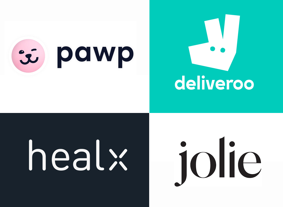
Source: pawp.com, Deliveroo, Huddlecreative, jolie
3. Gradients
Gradients are gathering momentum in 2023. They allow designers to experiment with colour and bring a simple shape to life by injecting some depth and interest into it. They went off-trend for a while but post 2020, following the rebrand of companies like Facebook Messenger, Instagram and Adobe Creative Cloud, they have come back to life with huge popularity by creating dynamism & vibrancy. They can range from a two-colour blend to a rainbow spectrum. This year, experimentation of layering and trying more muted colour combinations may be emerging.
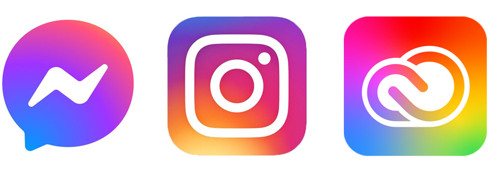
Source: Wikimedia
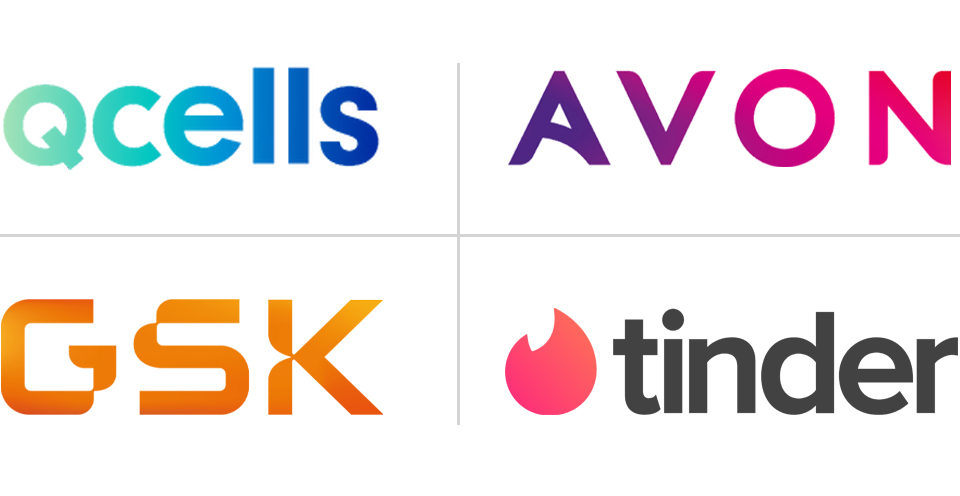
Source: Qcells, Wikipedia, Logos Fandom, Wikimedia
4. Layering
Logos using several overlapping layers will become more popular this year. It was a trend in 2022 and is set to continue but with development. Using shapes overlapped within a logo adds depth and interest, it can also help to create contrast. They usually work best as either a single letter pulled out within a name or as an icon in accompaniment to a simple logotype. We are set to see geometric shapes and letters be overlapped, as well as the use of transparency being used creatively. This is a great style for high-colour designs.
You have to be careful with this trend, as it can be chaotic and detract from the type if too much is going on. Designers must ensure there is clarity and purpose to the composition.
The PayPal logo, displayed below is an excellent example of layering, the logo uses an overlapped letter for its iconic “P”.
And this logo design for a company called Draggon, overlaps a simplified “D” to create a colourful icon and accompanies it with a simple “lowercase” (trend 2) sans serif typeface. They work in unity.

Source: Wikimedia, Tommey Stevenson
Here are some examples of layering which also incorporate a trend set to continue this year, gradients:
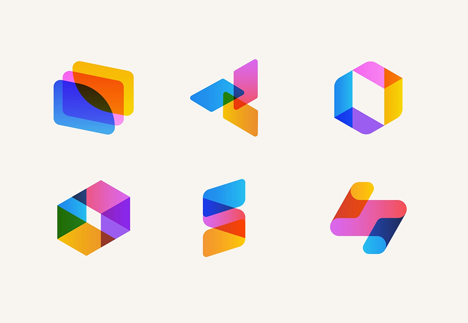
Source: Josh Warren
This layered logo uses an animation technique to layer up its logo and is teamed with a classic simple geometric sans serif. It works well static, using bars that signify skills, coming together but it also works extremely well as an animation:

Source: Behance
5. Custom or experimental typefaces

Source: Tony Wiley, Natense, Goopanic
Custom and experimental typefaces can provide clients a unique, memorable logo mark that is custom only to them. They can be fun and really show off a personality which makes them very popular. Minor tweaks can be made to the characters to add style and interest and in some cases pictorial features can be linked in to tie in with the brand.
As always with logo design, logotypes are confident and can be extremely successful in telling a brand story. However, the typeface choice is paramount. It must be chosen carefully to represent the characteristics of the brand and consideration needs to be given to the chosen style of font to ensure it is a good fit with the client’s industry and ethos.
They are a great choice to stand out from others and make an impact, a reason why this trend is really popular.
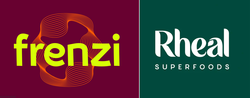
Frenzi is a drawn typeface with carefully considered angles and curves, balanced to express motion & movement and give the brand a unique twist. Whilst the characters form a very organic look on the Rheal logo - perfect for this brand! And the ‘a’ character is carefully adapted to incorporate a leaf symbol.
Final thoughts
Many design trends can come and go, but many will continue to evolve over time. These trends are often a reflection of what is going on in the environment around us, how we are feeling as a society and reacting to the visual world. The trends we’ve highlighted aren’t necessarily guaranteed to develop into 2024 and beyond, but it is clear to see that their origins have been seen before. They are a progression of what we have seen emerging over previous years. As a designer, and regardless of trends, there is a growing desire to create longevity and timelessness within a brand identity. Ultimately, the brand must lead the design in order to be a true reflection of company’s ethos and purpose and to appeal to their individual target audience.
Are you considering a brand refresh or need a new brand identity? Contact our team to see how we can help.
