Colour is an essential part of your branding toolkit and integral to communicating your core values and positioning your business. Forbes recently released a study, revealing the use of brand colours improves brand recognition by 80%, therefore choosing the right colours will help you reach your target audience, elevate brand messaging and raise brand awareness.
According to Pantone the colour of 2020 has been named as Classic Blue. Should new colour trends influence your choices? Whilst it is important to be aware of trends, and Classic Blue could be the perfect colour to communicate your brand, they are often transient and the psychology behind your choice in colour plays a far more significant role in how your business is perceived.
The Deeper meaning to Colour
Colour, in the simplest of terms, is how our brain interprets the light reflected by different objects in our surroundings. Each colour triggers a certain set of emotions that are hardwired in our brains according to branding strategy insider. So, from a brand communication perspective, how do you strike the right tone and create a strong emotional connection with your customers? The psychology of colour can help create an impact that resonates. How do you want your audience to feel when they see your brand? Are energising reds or calming, natural blue and green tones the right fit? Here, we look at some of the most popular brand colour choices and what message they convey.
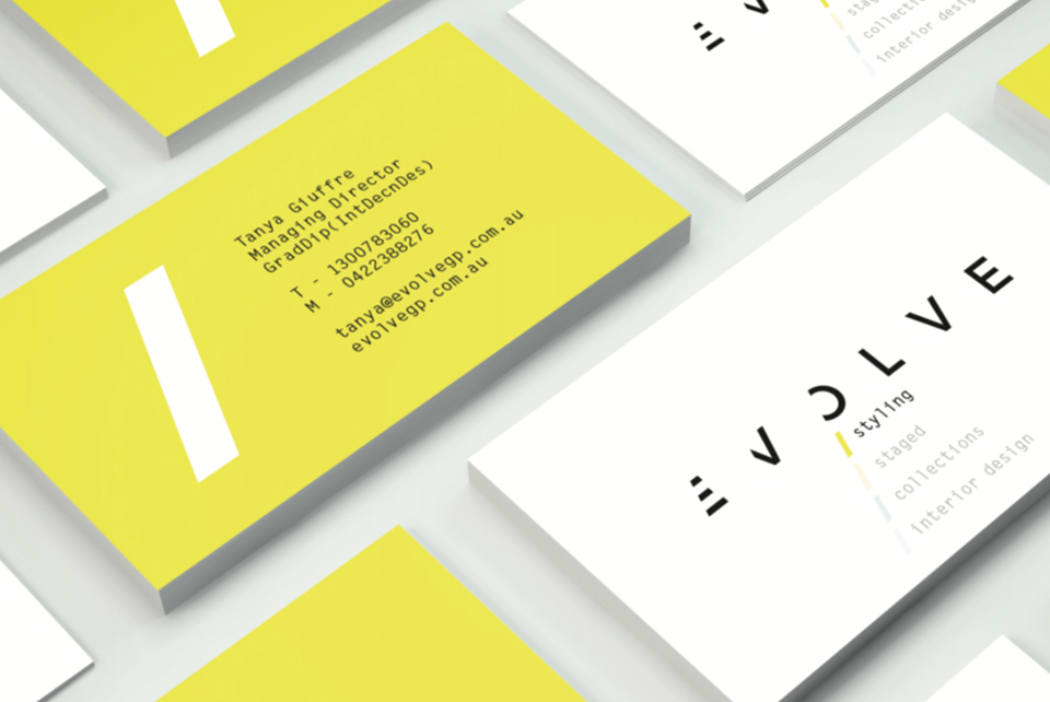
It was all Yellow
Yellow brings the sunshine, summer and happy days to mind. It puts a smile on your face and is associated with mental clarity. It is a bold, bright colour and can be great for stand-out visibility yet will always struggle against a white background.
Mr Blue Sky
According to imagibrand, blue is the most universally preferred colour to express trust, reliability and dependability. Big brands like Facebook, Twitter and Samsung have taken this colour on board. In fact, 1/3 of the world’s top 100 brands include the colour blue in their logos*. Blue can also communicate calm and harmony due to its association to the sky and sea.

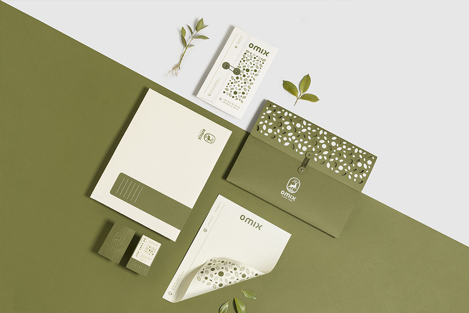
Just be good to Green
Green is a great way to communicate sustainability, nature and growth. Green is also seen as a sign of wealth and stability. The lighter the green the more your brand will lean to vitality and growth, a richer green will portray wealth.
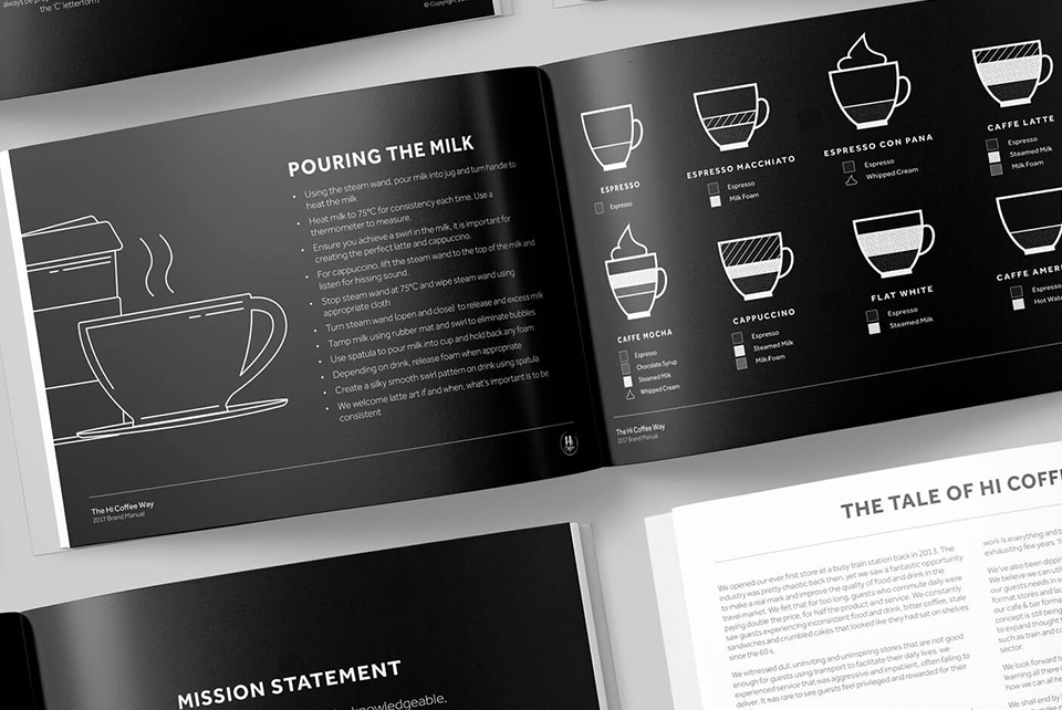
Back to Black
Black is another popular option. It's distinctive, memorable and bold. According to Marketo, the use of black will make your brand stand out from the crowd. Known for representing luxury, sophistication and exclusivity, black is a statement colour. Sometimes, simplicity is all that's required!
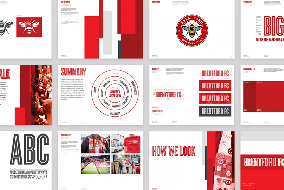
Simply Red
Reds are well known for being passionate, romantic, powerful and strong. Known for reducing our analytical thinking, the colour speeds up and intensifies our reactions. Hence, why when you see a Sale sign your attention is drawn to it. If you want to have instant impact, maybe red is for you?
A Purple Patch
Traditionally associated with royalty and nobility, purple also has a spiritual side and can also be linked to good fortune. The darker the purple, the more it represents luxury whilst lighter lavenders can portray nostalgia.

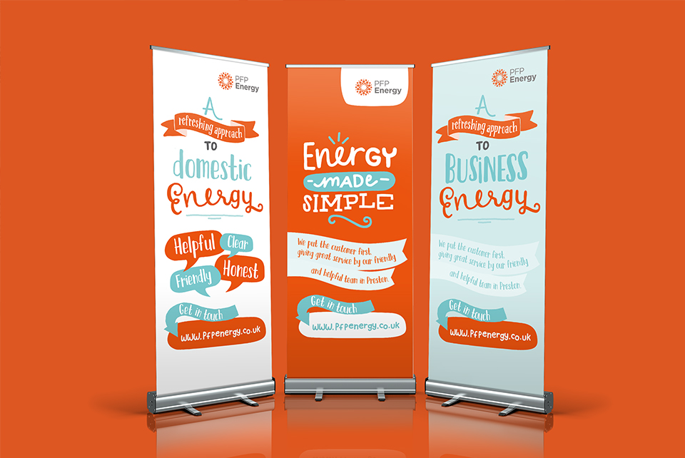
Is Orange the new black?
Blending the warmth of red with the optimism of yellow, the colour orange communicates energy and activity. Orange is best used for youthful, creative and adventurous brands and tends to be avoided by more premium, traditional, and heritage brands.
The psychology of colour has been studied for many years and there is still much debate over the exact impact it has on the human psyche. Whilst there are many variables that can affect how individuals interpret different colours such as culture, personal preference and experiences, it is important to view your brand identity as more than just an aesthetic. It should also communicate your core messaging and values. Through understanding the subconscious impact of colour and developing a cohesive brand palette that accurately conveys your business, you begin to build a truly authentic brand that reaches the right audience and holds relevance, purpose and longevity.
Are you thinking of updating your existing brand identity or starting a new business? Get in touch with our team to see how we can help.

