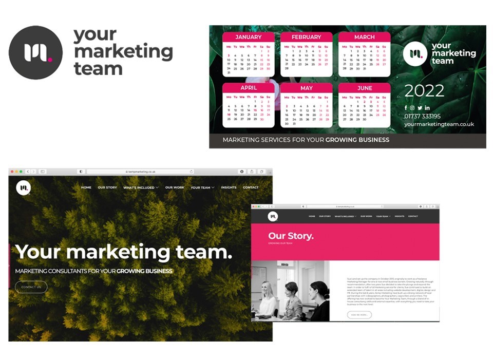
In our blog last week, Sue explained the reasons behind why we have recently changed our company name to Your Marketing Team. With the change of name came the need to update our brand identity. From the beginning, we all agreed that this would be more of an evolution of the existing brand rather than needing to develop a completely new brand identity. As with many businesses, we had invested time in building our brand awareness amongst our audience and we wanted to be able to continue to build on these foundations. In addition to this, our brand values remained the same and still resonated strongly with our core proposition. Laura, our Graphic Designer elaborates on the story behind the new design:
We are a team of people with a wide range of skill sets and expertise that combine to offer each of our clients a bespoke marketing team which is uniquely tailored to their individual requirements. We have also built a strong network of trusted partners, working in unison to deliver results. Therefore, the refreshed brand identity needed to convey the idea of linking, merging or having separate elements that combine.
Growth is in our company’s DNA and sits at the very heart of our service – ultimately our mission is to help our clients grow their business. Our brand imagery has reflected this since the very beginning, principally through the use of plants. Therefore, organic shapes or symbols that suggest growth; leaves, plants etc, seemed to be a good angle to pursue. However, I was conscious that this did not take us down a route of resembling the health sector or horticultural organisation.
The new design also needed to reflect our unique approach to offering a marketing service. A newer way to deliver marketing, stepping away from the traditional agency model and actively guiding our clients in strategy as opposed to following a pre-determined brief.
Stage 1
As usual with a branding project, I am let loose to be creative! No idea is dismissed immediately. It’s about trial and error and exploring shapes and ideas, which can often develop into something else.
My initial inspirations came from concepts and objects such as interlinking, thriving, growth, arrows, leaves, organic, and the letters themselves - ymt, m (marketing)…I like to start with some free-hand sketches:
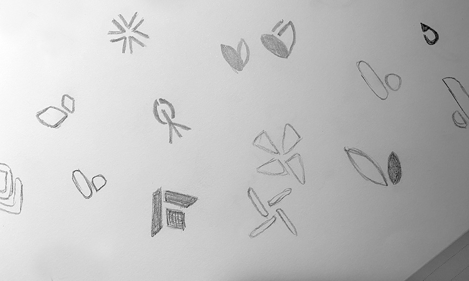
At the end of Stage 1, I had developed numerous ideas from my pencil sketches. Here are a few below:
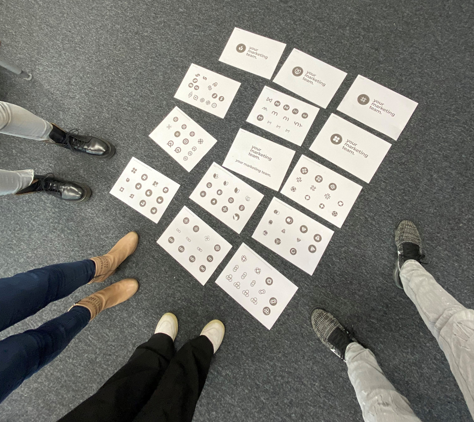
As a team, we all got together, spread all the printed sheets across the office floor and began eliminating those that didn’t quite fit the bill, discussing the different concepts and establishing which ones best reflected our service. At the end of the session, the main thing to come from the discussion was that the growth inspired designs felt more appropriate and my aim for Stage 2 would be to develop these further, looking at linking and overlapping elements.
Stage 2
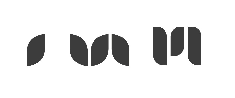
I developed the leaf options. It was through this process that I discovered an interesting design variant, creating an ‘m’ icon using separate leaf shape elements. This portrayed the idea of creating something from separate entities, reflective of the nature of our company, a diverse range of skills coming together, yet also formed a letter shape. The pink full stop gave that burst of colour and strength.
Stage 3
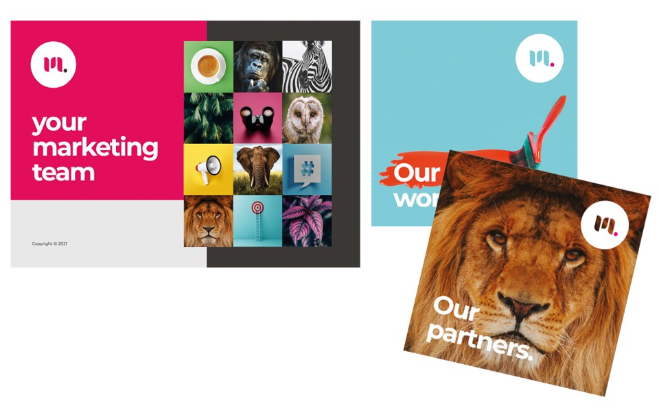
After presenting the final choices, 3 were shortlisted and presented in situ amongst our current promotional materials to see which worked the best for us. The logo still had to work well with our existing colour palette and brand imagery. It had to be strong enough to stand out and stand alone as an icon, replacing the ‘K’. It also had to be a good fit for us, not only portraying our key values but look professional and trustworthy.
And this is the final result:
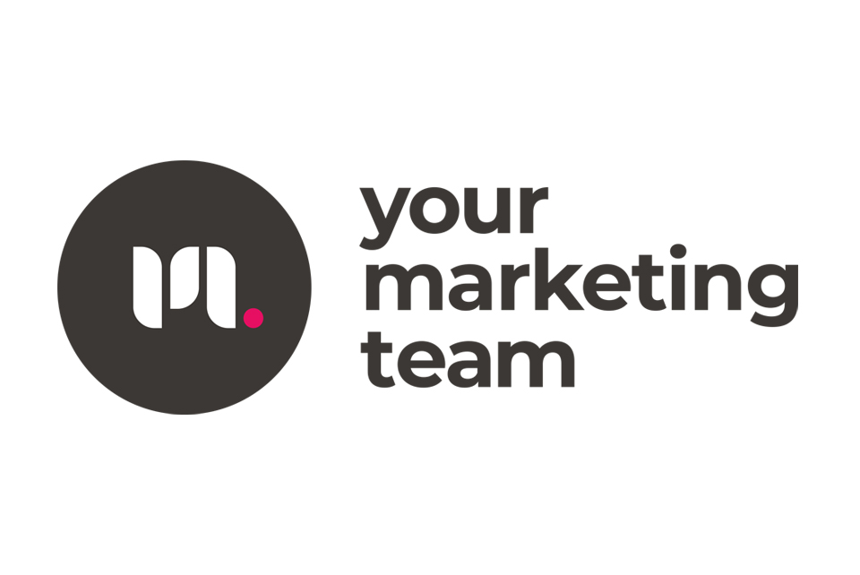
A logo that is punchy and strong. A more abstract depiction of the leaf and growth created by using organic shapes, whilst also showing the strength in individual aspects combining to form one entity – the ‘m’ of marketing and evolved from the idea of skills coming together to become your marketing team. The full stop gives it some power and assertion and adds that pop of colour. We have kicked out the ‘K’!
Are you thinking that your business could benefit from a brand update? Or are you embarking on a new business venture that needs a stand-out brand identity? Get in touch with our team. We’d love to hear from you!
© Copyright Your Marketing Team Ltd 2022

